
Yandex Pay Card
Yandex Pay Card
Yandex Pay Card
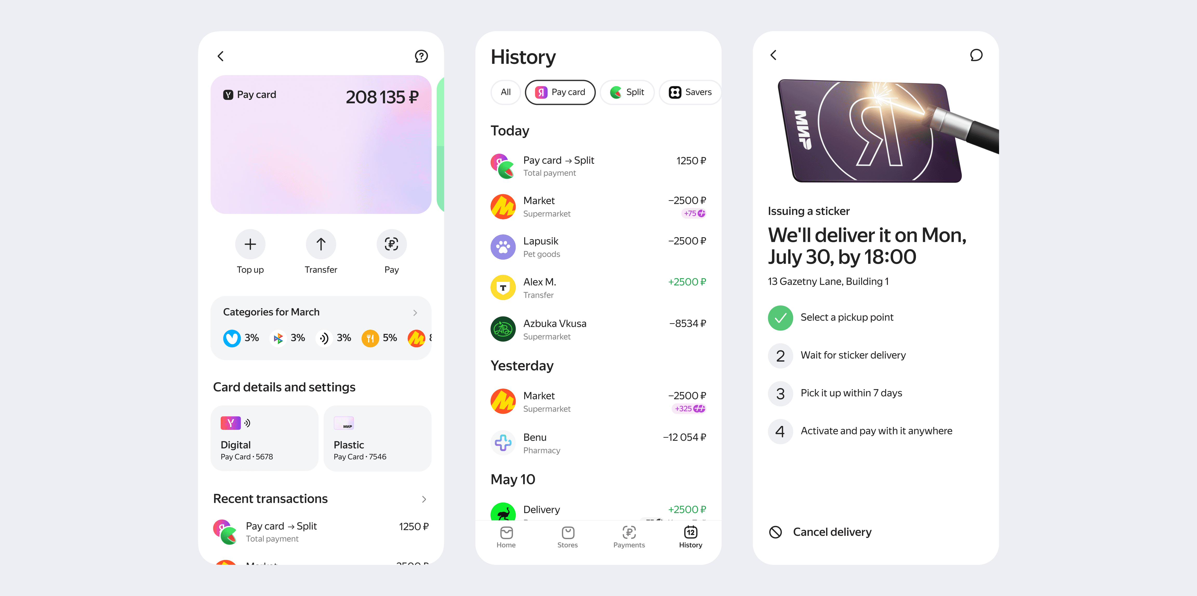
When I joined а project as a Product Designer, the debit card already supported everyday payments, but its structure was limited to scale. My responsibility was to rethink this vertical not as a set of separate features, but as a system that could grow and stay consistent with the overall banking ecosystem
When I joined а project as a Product Designer, the debit card already supported everyday payments, but its structure was limited to scale. My responsibility was to rethink this vertical not as a set of separate features, but as a system that could grow and stay consistent with the overall banking ecosystem
When I joined а project as a Product Designer, the debit card already supported everyday payments, but its structure was limited to scale. My responsibility was to rethink this vertical not as a set of separate features, but as a system that could grow and stay consistent with the overall banking ecosystem
Context
Context
Context
Pay Card is a core debit product at Yandex Bank, powering daily payments and access to other financial services
Pay Card is a core debit product at Yandex Bank, powering daily payments and access to other financial services
Pay Card is a core debit product at Yandex Bank, powering daily payments and access to other financial services.
My responsibility was to evolve this vertical into a scalable system rather than a set of isolated features
My responsibility was to evolve this vertical into a scalable system rather than a set of isolated features
My responsibility was to evolve this vertical into a scalable system rather than a set of isolated features
Pain point
Pain point
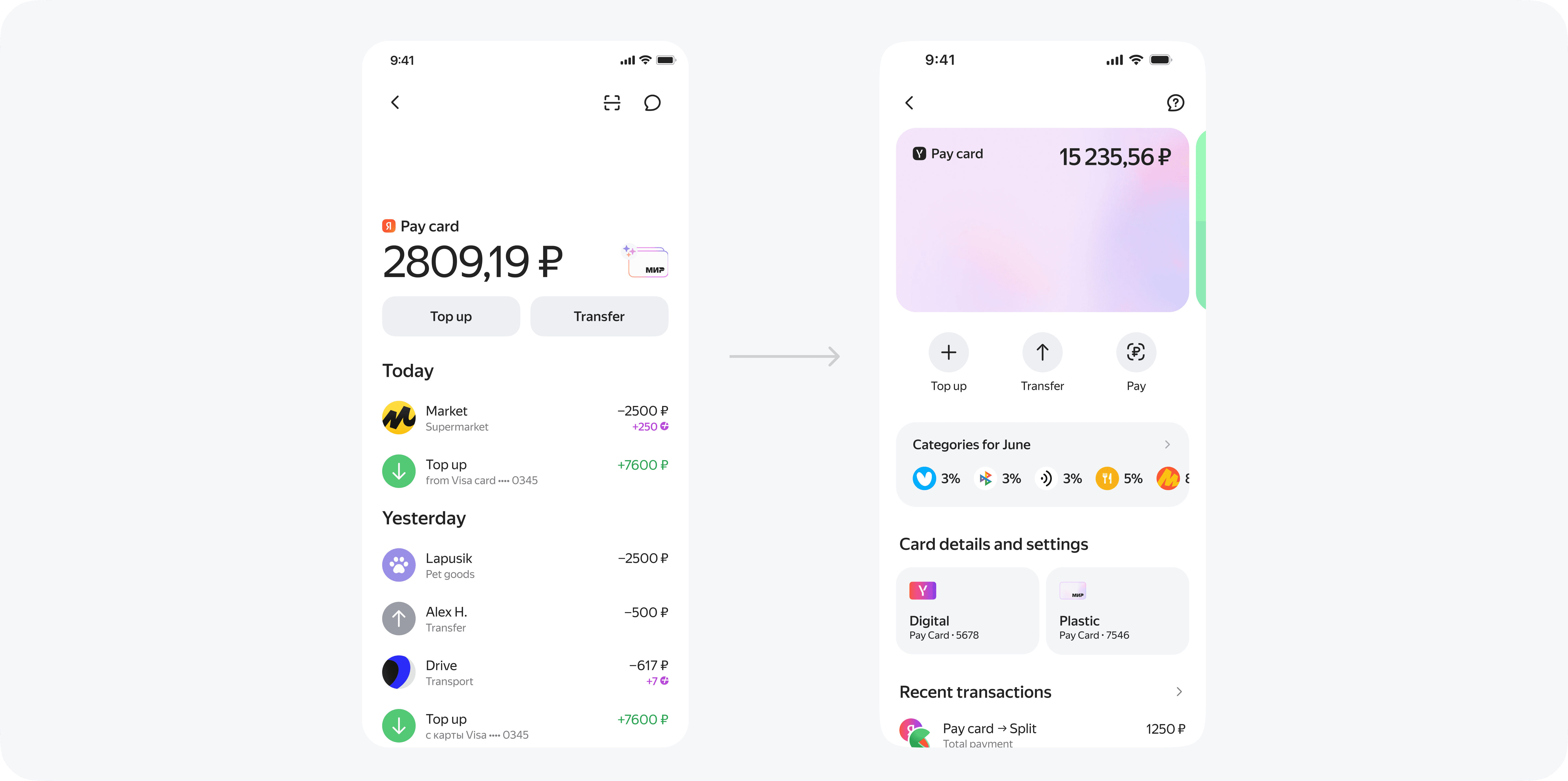
At MVP, the debit card experience covered only basic needs. Key controls were hard to find, and limited functionality left users with little control
At MVP, the debit card experience covered only basic needs. Key controls were hard to find, and limited functionality left users with little control
To address these limitations, I started by redefining the structure of the main card screen. The focus was on information hierarchy and interaction patterns that could support future growth

How I approached
the problem
I started by analyzing UX tests of the MVP and found that users struggled to locate key features — such as account and card details hidden behind a small icon — and rarely used QR payments due to low discoverability. Users also lacked visibility into their spending limits.
I redesigned the navigation using widget-based structure, removing the need for a separate menu and simplifying SDK integration. After validating the prototype through UX testing, we launched the new version, which remains in production today



Plastic card
Plastic card
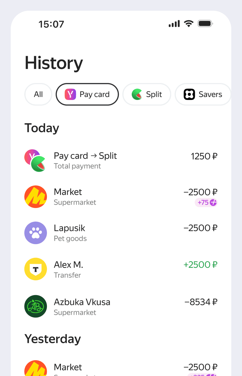
The most requested feature was a physical card, which also successfully drove external GMV growth
The most requested feature was a physical card, which also successfully drove external GMV growth
We started with a pilot of 10K phone payment stickers, then scaled distribution to 300K physical cards, and eventually to 1.7M
We started with a pilot of 10K phone payment stickers, then scaled distribution to 300K physical cards, and eventually to 1.7M
Card details
Card details
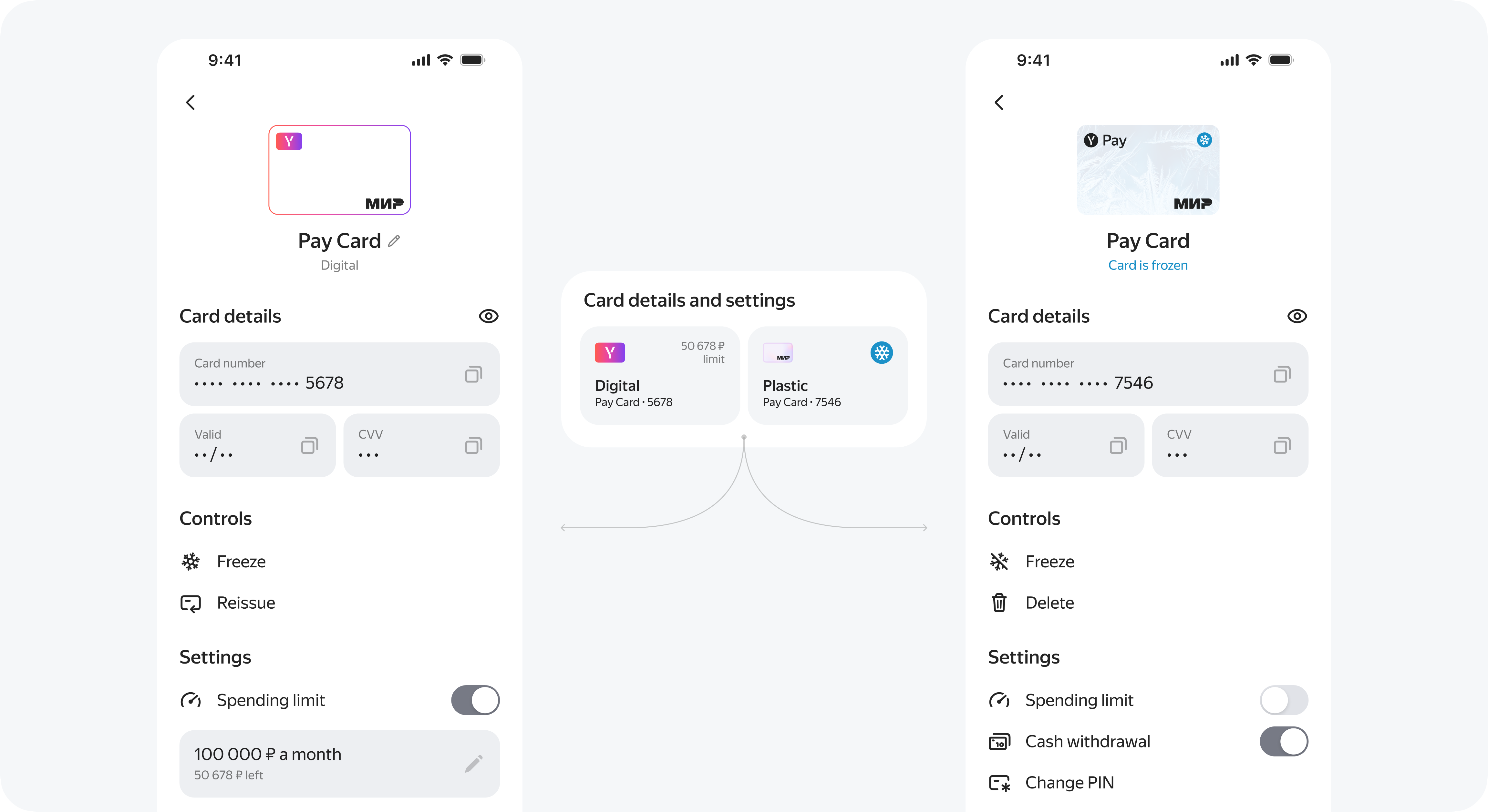
In the MVP, users struggled to find card details because they were hidden behind a small icon. I solved this by designing a dedicated card widget that surfaced key information upfront, such as limits, freeze status, and plastic card order status. As a result, users could access card details faster and better understand the card state at a glance
In the MVP, users struggled to find card details because they were hidden behind a small icon. I solved this by designing a dedicated card widget that surfaced key information upfront, such as limits, freeze status, and plastic card order status. As a result, users could access card details faster and better understand the card state at a glance

SDK integration
SDK integration
A flexible debit card experience across Yandex services
A flexible debit card experience across Yandex services
We expanded the debit card beyond the native banking app by building it as an SDK. This allowed us to integrate card management into multiple Yandex services, adapting it to different user flows and contexts
Cross-platform
Cross-platform
We also introduced a desktop version, giving users more flexibility and access across platforms. This allowed us to integrate card management into multiple Yandex services, adapting it to different user flows and contexts
Outcomes
Outcomes
Redesigned the debit account experience by introducing QR payments, cashback visibility, card details, and auto top-up — increasing GMV by 45% (€219M → 318M)
+45%
+45%
GMV month
€219M → 318M
+29%
+29%
MAU
2.8M → 3.6M
+6 pp
+6 pp
Card details open rate
8 → 14%
Pain point
At MVP, the debit card experience covered only basic needs. Key controls were hard to find, and limited functionality left users with little control. To address these limitations, I started by redefining the structure of the main card screen. The focus was on information hierarchy and interaction patterns that could support future growth
Cross-platform
A flexible debit card experience across Yandex services. We expanded the debit card beyond the native banking app by building it as an SDK. This allowed us to integrate card management into multiple Yandex services, adapting it to different user flows and contexts
How I approached
the problem
I started by analyzing UX tests of the MVP and found that users struggled to locate key features — such as account and card details hidden behind a small icon — and rarely used QR payments due to low discoverability. Users also lacked visibility into their spending limits.
I redesigned the navigation using widget-based structure, removing the need for a separate menu and simplifying SDK integration. After validating the prototype through UX testing, we launched the new version, which remains in production today
Plastic card
The most requested feature was a physical card, which also successfully drove external GMV growth. We started with a pilot of 10K phone payment stickers, then scaled distribution to 300K physical cards, and eventually to 1.7M
Outcomes
+45%
GMV month
€219M → 318M
+4 pp
GMV within Yandex
51 → 55%
+29%
MAU
2.8M → 3.6M
+6 pp
Card details open rate
8 → 14%
Redesigned the debit account experience by introducing QR payments, cashback visibility, card details, and auto top-up — increasing GMV by 45% (€219M → 318M)
Card details
In the MVP, users struggled to find card details because they were hidden behind a small icon. I solved this by designing a dedicated card widget that surfaced key information upfront, such as limits, freeze status, and plastic card order status. As a result, users could access card details faster and better understand the card state at a glance
SDK integration